Acrylic Prints vs Metal Prints: A 2026 Buyer's Guide
You've chosen the photograph. You can already see where it will live. It might be a large alpine panorama over a fireplace, a moody shoreline in a stairwell, or a luminous mountain scene anchoring a reception area. Then the final question arrives: acrylic or metal?
For collectors buying limited-edition fine art, that choice isn't a technical footnote. It changes how the image carries light, how it holds a wall, how it ages in a room, and how the edition feels as an object. The same photograph can feel immersive and jewel-like in acrylic, or crisp and architectural on metal.
I guide this decision the same way I'd guide the selection of image size or frame finish. Not by asking which material is “better” in the abstract, but by asking which medium best serves this photograph, this space, and this collector's priorities. A misty, tonal image meant for close viewing often asks for something different than a bold, graphic scene intended for a bright commercial interior.
Before discussing taste, it helps to see the practical differences side by side.
| Characteristic | Museum-Grade Acrylic Print | HD Metal Print |
|---|---|---|
| Construction | Face-mounted print viewed through acrylic | Dye-sublimated image infused into coated aluminum |
| Visual feel | Deep, glossy, dimensional | Sleek, crisp, direct |
| Colour behaviour | Strong depth and nuanced tonal rendering | Punchy contrast and saturation |
| Profile | Thicker presentation | Thinner presentation |
| Handling | Heavier and more delicate at the surface | Lighter and easier to handle |
| Best fit | Statement pieces, gallery realism, luxury interiors | Durable installs, humid spaces, modern minimal settings |
Choosing Your Finish Between Acrylic and Metal Prints
A collector recently described the dilemma perfectly. The image was decided. The wall was measured. The room had clean lines, warm wood, and generous daylight. What remained was the finish, and with it, the question of mood.
The acrylic version gave the photograph a sense of interior light. The image seemed to sit beneath the surface, with a depth that pulled the eye inward. The metal version felt different. More immediate. Slimmer on the wall. More graphic in its delivery.
That's the key discussion inside acrylic prints vs metal prints. Both belong in the premium end of photographic presentation. Both can suit limited-edition work. But they don't tell the same story.
What the material says about the artwork
Acrylic often suits photographs that reward stillness. Tonal skies, layered mountains, reflective water, or colour transitions that benefit from a more immersive surface. It tends to heighten the sense that you're looking into the image, not only at it.
Metal tends to suit photographs with structural clarity. Bold contrast, strong horizon lines, graphic weather, monochrome work, and pieces going into spaces where simplicity and resilience matter as much as refinement.
Collector's lens: In limited-edition work, the medium becomes part of the edition itself. It shapes not only appearance, but the collector's experience of ownership.
Start with the room, not the product list
Three questions usually lead to the right answer:
- What does the photograph need? Some images need subtle gradation and depth. Others want crispness and punch.
- How will the room light the piece? Daylight, accent lighting, and glare all change the outcome.
- What kind of object do you want on the wall? Thick and jewel-like, or slim and architectural.
When buyers treat the finish as an artistic decision rather than a manufacturing option, the right choice becomes much clearer.
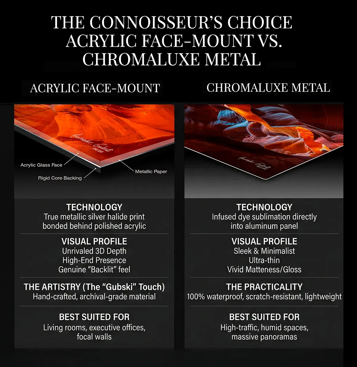
Understanding the Mediums and Production Process
The easiest way to understand the difference is to think in terms of structure. Acrylic is layered. Metal is infused. That single distinction explains much of what collectors notice later on the wall.
How acrylic is built
An acrylic print is typically a face-mounted construction. Bay Photo describes it as a fine-art image mounted with a clear optical adhesive and viewed through 1/8-inch or 1/4-inch acrylic, which increases perceived depth and colour range. The same source notes that this approach is the more technically demanding option in high-end photo display, while metal is thinner and usually lighter. Their comparison is helpful if you want a precise breakdown of acrylic face-mount construction and finish options.
In studio terms, acrylic behaves like a window over the image. Light passes through the clear surface before reaching the photograph. That added optical layer is what gives a strong face-mounted piece its depth and polished presence.
For collectors considering premium acrylic presentation, this overview of acrylic mounted fine art prints is a useful companion to what happens in practice.
How metal is built
A metal print works differently. The image is transferred through dye sublimation directly into a specially coated aluminum panel. Instead of placing a print behind a clear sheet, the colour becomes part of the coated surface itself.
That gives metal its clean, contemporary look. Fewer optical layers. A slimmer object. A more straightforward interaction between image and panel.
Why the process matters to the collector
Acrylic asks for precision because every layer affects clarity. If the face-mount is done well, the result feels luxurious and optically rich. If the photograph itself has tonal subtlety, acrylic often reveals that quality beautifully.
Metal is more direct. It strips away some of the layered object quality and replaces it with sharpness, efficiency, and a pared-down physical profile. On a large wall, especially where handling matters, that difference becomes tangible.
A simple way to frame it:
- Acrylic print if you want a dimensional art object with depth in the viewing experience
- Metal print if you want a refined, durable panel with a slimmer visual footprint
The production method isn't hidden backstage detail. It is the reason the final artwork feels the way it does.
Detailed Comparison of Appearance and Visual Impact
Collectors usually notice appearance first, and rightly so. The finish changes how the photograph speaks before anyone asks how it was made.
Depth and dimensionality
Acrylic is the medium most associated with visual depth. Because the image sits behind a polished clear layer, the photograph can appear to float slightly beneath the surface. On the right image, especially scenic work with receding planes, water, fog, or luminous sky, that effect is striking without feeling theatrical.
Metal doesn't create that same layered depth. Its strength is a more immediate surface read. The image feels flatter in the literal sense, but often more decisive. It presents the composition with a clean edge and a contemporary directness that suits modern interiors.
Key differentiator: Acrylic draws the eye inward. Metal presents the image outward.
Colour rendition
These distinctions often guide many buyers' final decisions. A photographer review from Bumblejax says acrylic can provide a “sizable upgrade” in colour accuracy, vibrancy, and longevity, while discussions comparing the processes also note that metal can be more contrasty and saturated but may show reduced colour gamut and gradation than a well-executed acrylic face-mount. The same review is a strong reference for anyone weighing colour accuracy and vibrancy in acrylic versus metal prints.
For subtle scenes, acrylic often handles tonal transitions with more grace. Dawn skies, snowfields, mist, reflections, and complex shadows tend to benefit from that smoother rendering. This is one reason collectors chasing gallery realism often favour it.
Metal often looks bolder at first glance. Contrast feels assertive. Saturation can read as vivid and energetic. That can be exactly right for dramatic weather, urban work, graphic seascapes, and images where punch matters more than delicate tonal progression.
If you want to compare the character of dye-sublimated aluminum in more detail, this guide to Chromaluxe metal print presentation helps explain why the finish feels so distinct.
Gloss and light interaction
Acrylic has a glossy, premium surface that many collectors love under controlled lighting. Spot lighting and warm accent lighting can make it look almost illuminated from within. In bright interiors, though, reflectivity matters. Bay Photo also offers TruLife and non-glare variants, which speaks to how important reflection control can be for large, high-end installs.
Metal also reflects light, but the experience is different. It reads less like a deep polished lens and more like a clean contemporary panel. The surface can feel more restrained as an object, even when the image itself is vivid.
Here's the quick visual summary.
Visual Characteristics at a Glance
| Characteristic | Museum-Grade Acrylic Print | HD Metal Print |
|---|---|---|
| Depth effect | Strong sense of dimensionality | Minimal dimensional effect |
| Tonal transitions | Smooth and refined | Strong but more contrast-driven |
| Colour feel | Rich, nuanced, immersive | Punchy, saturated, graphic |
| Wall presence | Luxurious and substantial | Sleek and contemporary |
| Best image types | Layered landscapes, tonal scenes, gallery pieces | Bold compositions, modern imagery, high-impact installs |
The trade-off in plain language
Choose acrylic when the image deserves richness, depth, and a more collected feel. Choose metal when you want clarity, modern restraint, and a finish that gets out of the way of the room's architecture.
Evaluating Durability Archival Quality and Care
Collectors often focus on appearance first and maintenance later. That's understandable, but in real interiors the practical side matters. A large artwork doesn't only need to look right on day one. It needs to remain convincing after shipping, installation, cleaning, seasonal humidity, and years on the wall.

A useful benchmark from print-industry testing compares a 12×18-inch acrylic print at 4.37 pounds with an HD metal print of the same size at 1.6 pounds, making acrylic about 2.7× heavier. The same reference describes metal prints as scratch-resistant, waterproof, and flame-retardant, while acrylic requires more caution with smudges and surface care. That practical comparison is outlined in this discussion of weight, durability, and handling differences between acrylic and metal prints.
Where metal has the practical edge
Metal earns its reputation in difficult environments. If a piece is going into a coastal property, spa-like bathroom, hospitality suite, wellness setting, or another moisture-prone interior, metal is often the more forgiving choice.
It also helps on large-format installs where weight affects everything around the artwork:
- Shipping and transport: Lighter pieces are easier to move safely.
- Installation planning: Wall conditions and hardware become less demanding.
- High-traffic settings: A tougher surface is easier to live with.
Metal is often the finish I'd choose when the room is asking the artwork to work hard, not just look beautiful.
How to care for each finish
Acrylic rewards careful ownership. Its glossy surface is part of its appeal, but it also shows fingerprints, smudges, and careless cleaning more readily. Collectors who love acrylic should be comfortable treating it the way they'd treat a polished luxury surface.
Metal is usually simpler day to day. It still deserves proper care, but it generally tolerates handling and cleaning with less anxiety.
A good care routine stays simple:
- Use a soft microfiber cloth: This avoids introducing fine surface marks.
- Clean gently, not aggressively: Pressure does more harm than dust.
- Avoid abrasive products: Harsh materials can damage either finish.
- Plan placement wisely: Keep any premium print away from avoidable impact risk.
For long-term ownership, both finishes can serve well. The difference is that acrylic asks for more respect at the surface, while metal gives more margin for ordinary life.
Guidance on Sizing Mounting and Framing
A finish never hangs in isolation. It lives at a certain scale, on a specific wall, viewed from a particular distance. That's why sizing, mounting, and framing often decide whether a print feels resolved or merely large.
Matching scale to viewing distance
Acrylic is especially rewarding when viewers will spend time close to the work. In an entry, stair landing, dining room, or lounge where people approach the image, its depth and subtle transitions become part of the experience. A collector doesn't only register the composition. They register the surface and the sense of looking into it.
Metal tends to read strongly from farther back. In larger open rooms, corridors, commercial lobbies, and spaces where people encounter the work in motion, its crispness and directness hold up very well.
That doesn't mean acrylic must be small or metal must be distant. It means the viewing rhythm matters:
- Close, contemplative viewing: Acrylic often reveals more.
- Mid-range to far viewing: Metal often lands faster.
- Large walls with logistical constraints: Lighter metal can simplify the entire install.
Frameless or framed presentation
Both finishes are often shown with a rear float mount, which lifts the piece slightly from the wall and creates the clean, floating effect buyers expect from contemporary photographic presentation.
Frameless works especially well when the architecture is modern and the photograph itself carries enough authority to stand without a border. Acrylic frameless pieces can feel sleek yet substantial. Metal frameless pieces feel even leaner, almost architectural.
A frame changes the conversation. It gives the artwork more ceremony, more edge definition, and often more compatibility with layered interiors that include wood, stone, textiles, or traditional detailing. For buyers considering a more classical presentation, this overview of ROMA moulding custom framed photography shows how a frame can shift the feel of the finished piece.
Practical mounting judgement
Mounting isn't only about style. It's about the object's physical reality on the wall.
A good rule of thumb:
- If the room wants a sleek floating presence, stay frameless.
- If the wall is large and the surrounding design has visual weight, a frame can help the art hold its ground.
- If installation ease is a major concern, metal's lighter profile is often the simpler path.
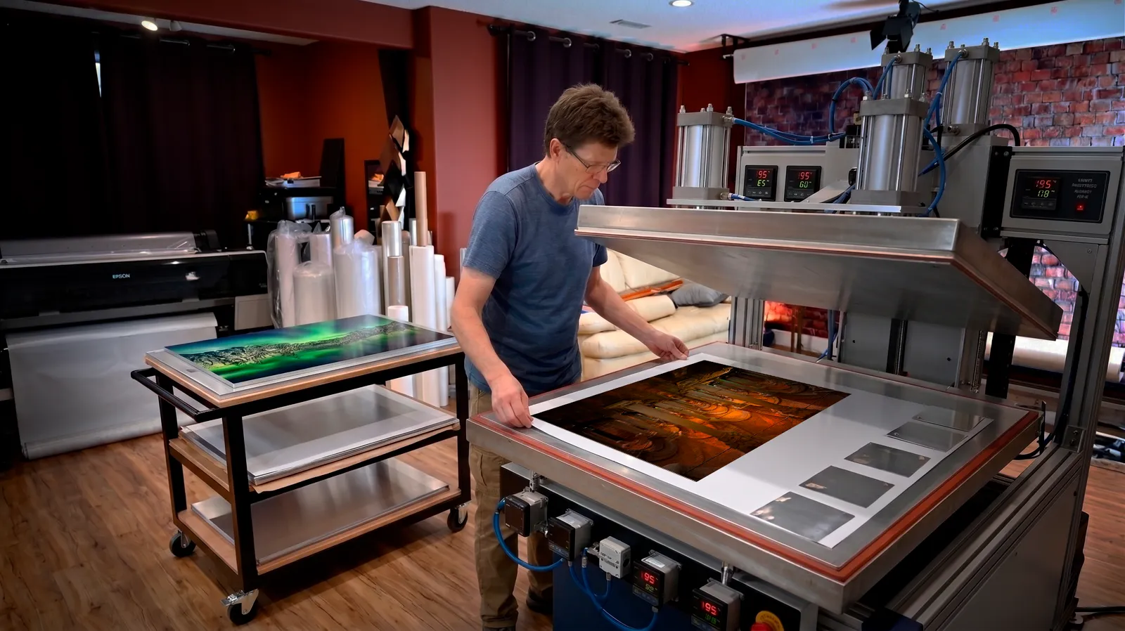
One practical example from the market: Alex Gubski Photography offers both HD metal and acrylic finishes, along with consultation on sizing, mockups, and framing options, which is the kind of service that matters when the artwork is being specified for a particular wall rather than bought as a standard décor item.
Analyzing Pricing and Value for Limited Editions
Collectors comparing fine art photography options often arrive here after researching gallery photographers. If you're specifically evaluating Peter Lik alternative prints, the same acrylic face-mount process is available directly from independent artists at a fraction of gallery pricing.
Collectors rarely ask only, “Which one costs less?” They usually ask a better question. What am I getting for the extra spend, and will I see it every day?
That's the right approach with acrylic prints vs metal prints. The price gap reflects a difference in construction and viewing experience, not a simple ladder of good, better, best.
Why acrylic costs more
According to a 2026 industry post, acrylic prints are typically 10–20% more expensive than metal at both production and retail because of the face-mounting process. The same source also notes that reviews often position metal as the more affordable option and acrylic as the “gold standard” when budget allows. That pricing discussion appears in this analysis of acrylic versus metal print cost and market positioning.
The reason is easy to understand. Acrylic uses a more demanding build, more optical material, and more exact finishing. Metal is still a premium product, but it is usually the more economical route to a polished contemporary presentation.
When the premium is worth paying
Acrylic earns its premium when the photograph is the room's emotional centre. If the piece is the focal artwork in a living room, primary bedroom, executive office, or collector's hallway, the depth and colour refinement can be visible enough to matter every single day.
Metal is often the stronger value when one or more of these are true:
- The room is humid or demanding: durability becomes part of the brief.
- The artwork is oversized: weight and handling start to affect cost and complexity around the piece.
- The design language is minimal: a slimmer object supports the architecture.
- The buyer wants impact without paying for maximum optical depth: metal often lands that balance well.
Price matters. But for limited editions, the more useful measure is return on visual impact over years of ownership.
The smartest buyers don't chase the cheaper finish or the pricier one. They spend where the difference will be seen.
Making the Final Decision for Your Space
By this point, the choice usually narrows quickly. What remains is aligning the finish with the role the artwork will play.
The choice for a collector's home
If the photograph is meant to be the room's anchor, acrylic is often the right answer. It suits collectors who want the work to feel substantial, immersive, and unmistakably premium. Scenes with layered distance, reflected light, atmospheric colour, and subtle gradation tend to benefit most.
Choose acrylic if your answers sound like this:
- I want the piece to feel luxurious up close
- The photograph has delicate tonal shifts
- This is the centrepiece, not one artwork among many
- Lighting can be controlled or managed well
The choice for hospitality and commercial settings
Metal usually makes more sense when the space is active, bright, humid, or operationally demanding. It's also a natural fit for interiors that favour slim profiles and contemporary restraint.
Choose metal if your priorities sound like this:
- The work needs to be durable and easier to maintain
- The room has moisture exposure or heavy use
- Installation simplicity matters
- I want a modern, crisp presentation without the acrylic premium
A simple decision path
Ask the questions in this order:
- Is maximum visual depth the top priority?
If yes, lean acrylic. - Will the print live in a humid, high-traffic, or hard-working space?
If yes, lean metal. - Does the image rely on subtle colour transitions and gallery realism?
If yes, acrylic usually serves it better. - Does the room favour a slim, contemporary object with easier handling?
If yes, metal is often the cleaner fit. - Is this the one hero piece where finish quality will be noticed daily?
If yes, acrylic may justify the added spend. If not, metal may be the more rational choice.
The best finish is the one that lets the photograph become fully itself in your space. Not louder than the image. Not more practical than the room requires. Just right for the way you want to live with the work.
Weighing acrylic vs metal for your wall?
If you're considering a limited-edition piece and want guidance on finish, scale, or framing, I offer direct studio consultation to help match the photograph to the wall, the light, and the kind of presence you want the artwork to have.