
The IKEA Design Secret: How Showroom Lighting Creates That Cozy Feeling
Walking through an IKEA showroom I have noticed something interesting. You step into a living room vignette — a soft armchair, a fireplace, a mirror catching the light just right. The room feels warm. It feels inviting. You start picturing your own furniture out and this furniture in.
Then you get home. You buy the same armchair. You buy the same mirror. You arrange them just as carefully. The room feels fine. It just doesn't feel the same.
The furniture didn't change. One thing did: the lighting that made that showroom feel so warm. IKEA doesn't sell it.
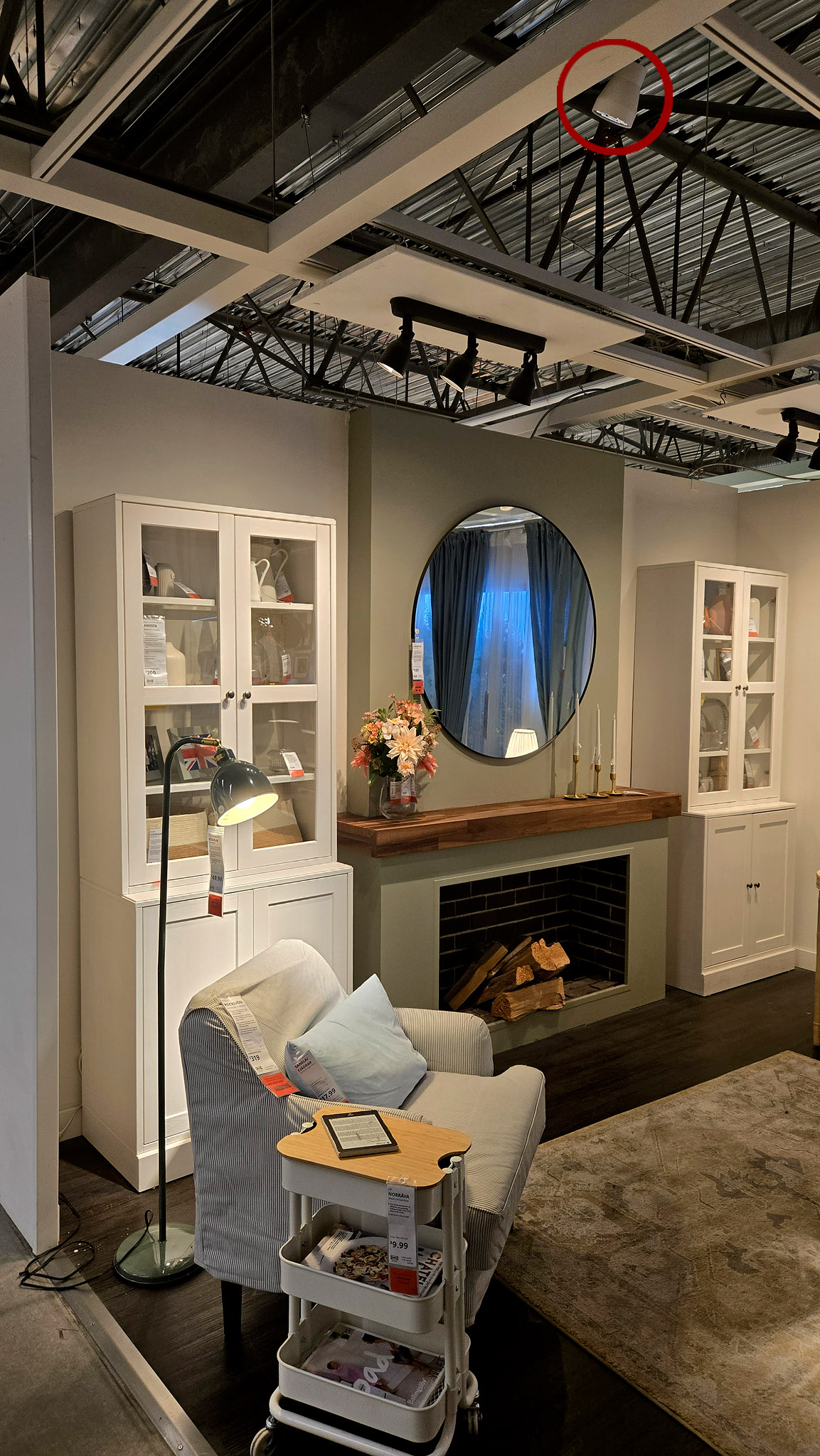
The Real Star of Every IKEA Vignette Isn't on the Shelf
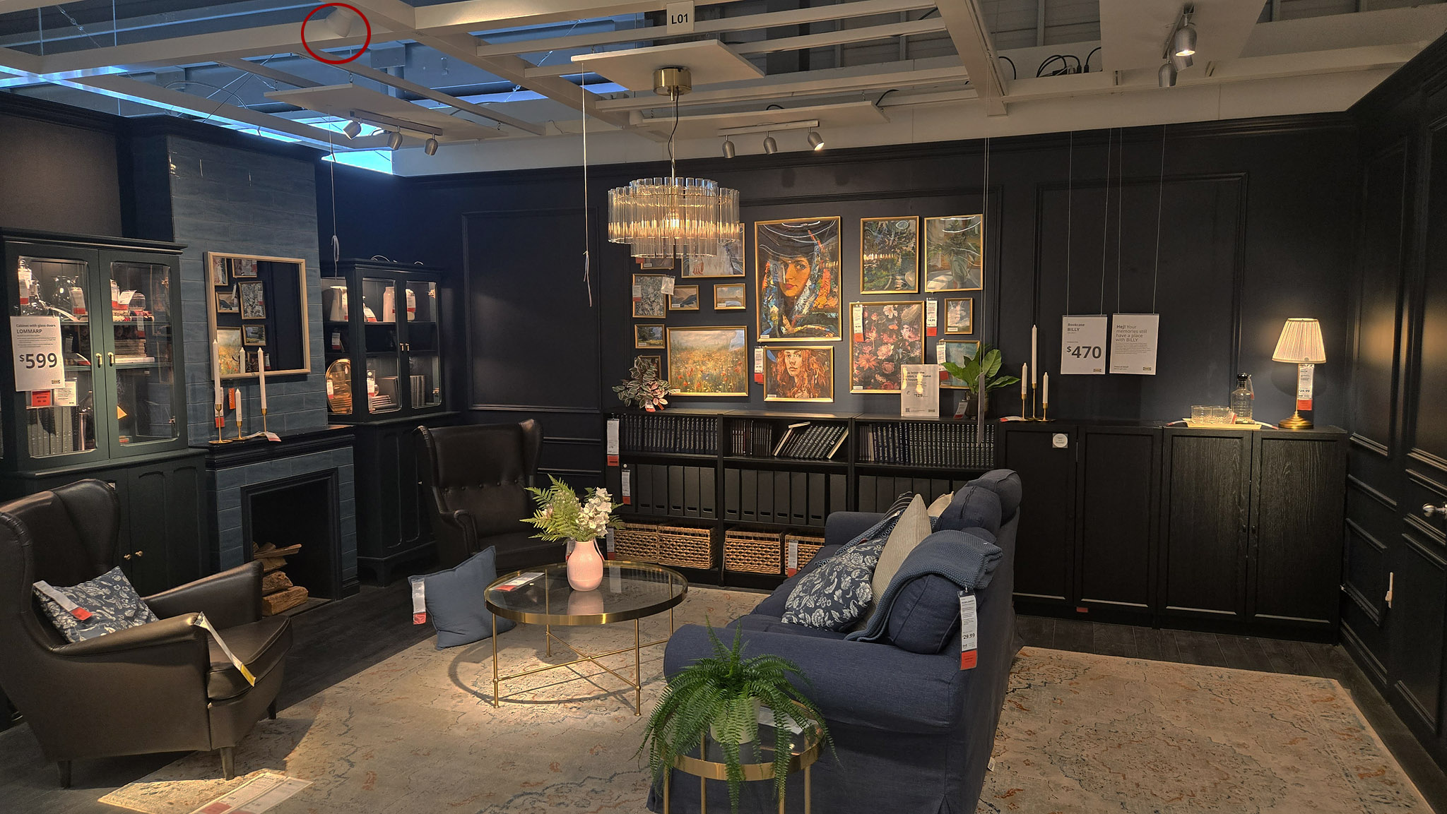
Look up instead of at the furniture, and you'll spot them. Each one aims at a single point — a cabinet face, a mirror, an armchair. No diffusers. No visible housing. They tuck into the ductwork and ceiling grid on purpose. Your eye skips right past the fixture and lands only on the light itself.
This is theatrical lighting. Museums and stage designers have used it for decades. It's also the reason IKEA's room sets feel like more than the sum of their furniture.
You won't find this technique on a price tag or a product page. You can buy every item in a vignette — the chair, the mirror, the rug — and the room still won't feel the same. The lighting was doing most of the work. It's also the one part of the room you can't actually bring home with you.
The light fixtures IKEA sells — pendants, table lamps, LED bulbs, and the rest of the aisle — play a surprisingly minor role in those attractive room sets. They're meant for real homes: general brightness, task light, a decorative shade over the dining table. Useful, but rarely theatrical. The mood you remember from the showroom comes from a different category entirely: accent fixtures mounted in the ceiling grid for display only, aimed at one surface at a time, often warm and narrow-beam. Those units aren't packaged for the cart. They're the lighting that makes the layout feel intentional, and they're doing far more of the design work than anything on the sales floor with a price tag.
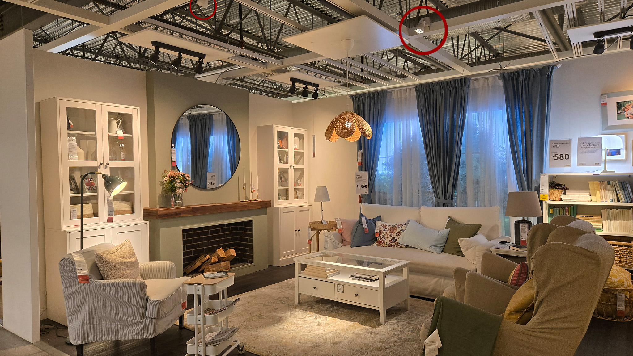
Retail lighting fills a room; showroom accent light sculpts it. The difference is easy to miss until you compare what's for sale with what's wired above the set.
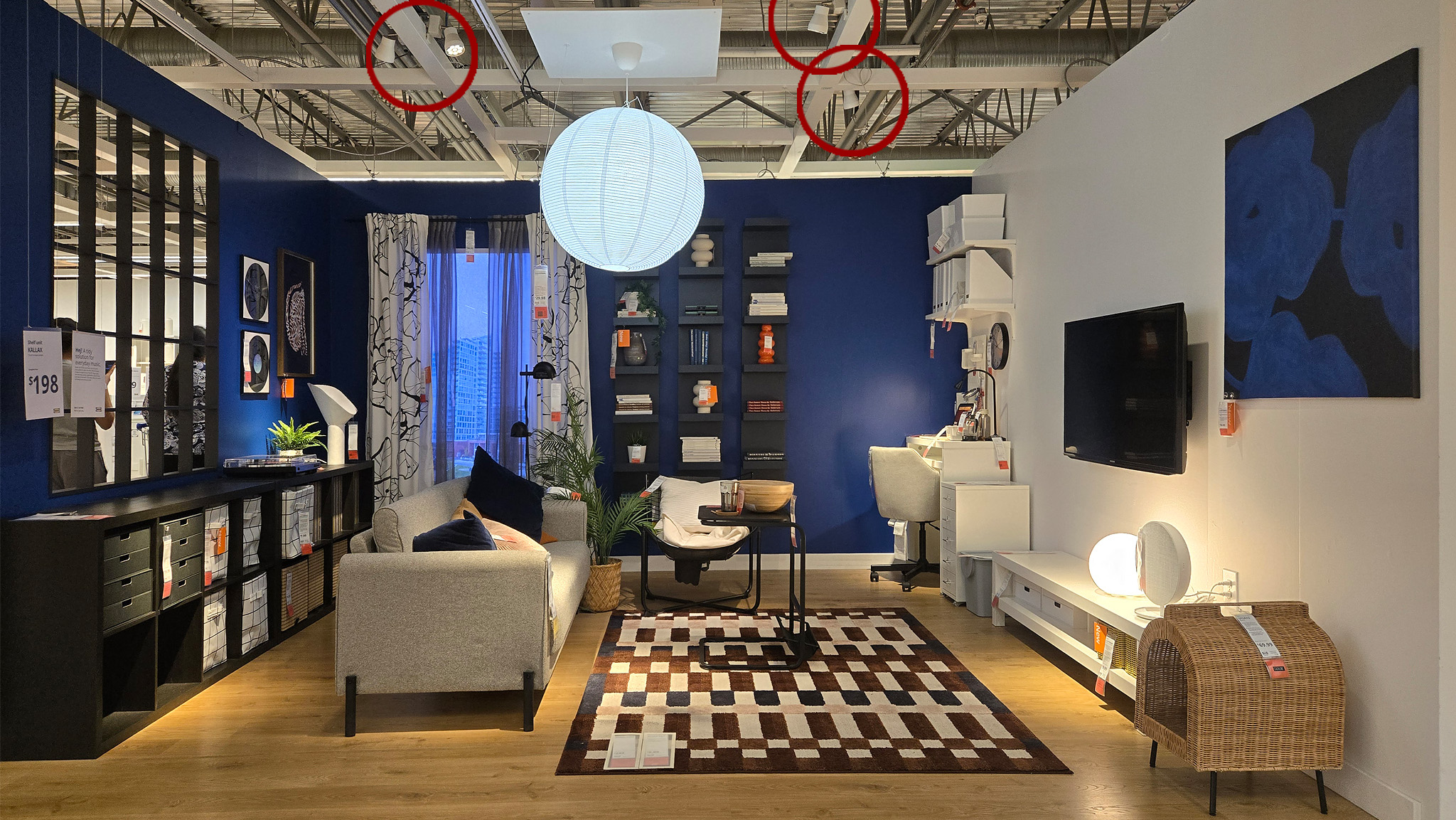
Another vignette, same story: the glow on the furniture and walls is coming from aimed spots, not from the lamps you'd carry out under your arm.
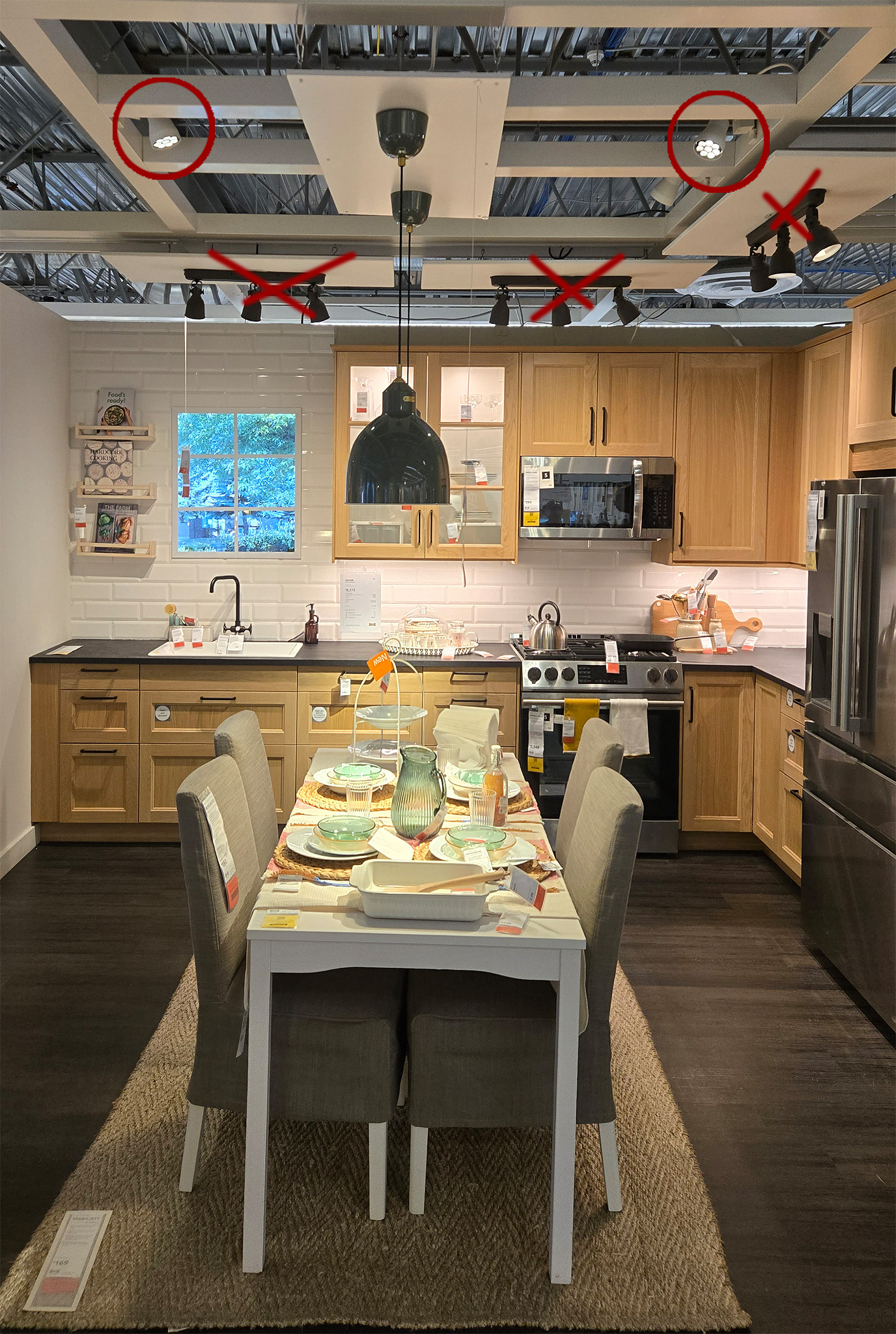
Look for the beam, not the bulb in the catalog. The fixtures that create this feeling usually aren't the ones offered for sale.
Three Lighting Habits Worth Learning From IKEA
1. Light the object, not the room. Most homes light for function: one ceiling fixture, evenly spreading light everywhere. IKEA does something different. A narrow beam hits one focal point — a chair, a countertop, a mantel — and everything else falls into soft shadow. Even light reads as ordinary. Uneven light reads as intentional.
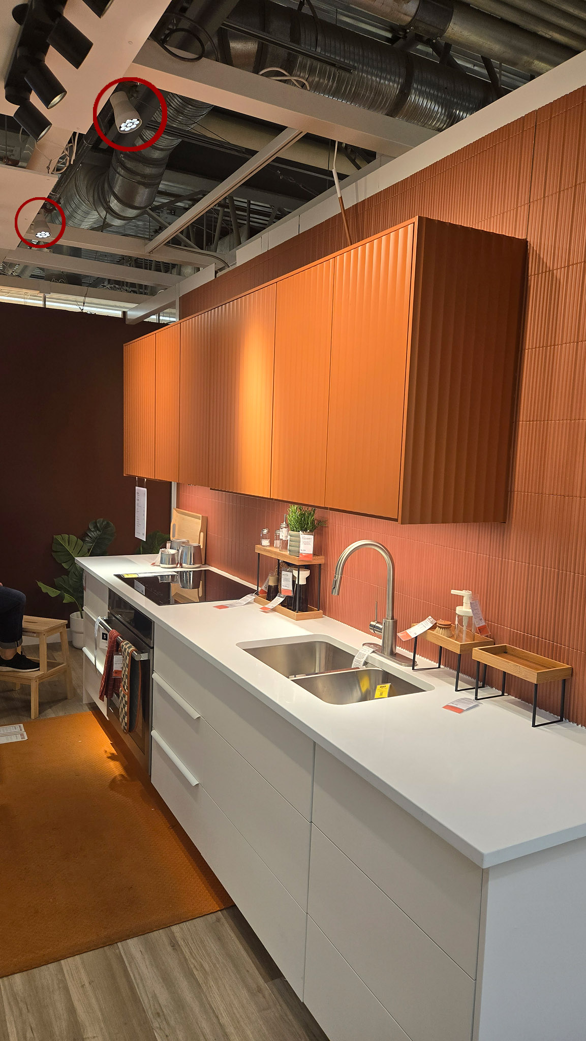
2. Keep the color temperature warm. These spotlights sit around 2700K–3000K — close to candlelight. Warm light relaxes people. It also makes wood, skin tones, and warm materials look richer than they do under cooler, daylight-balanced light.
3. Let the light source disappear. This is the detail most people miss. IKEA picks fixtures small and dark enough to blend into ceiling clutter — ductwork, track rails, structural beams. Your brain registers the glow, not the lamp. A visible fixture pulls focus. A hidden one lets the light do the talking.
Why This Matters Beyond the Showroom
Here's the simple truth: the same painting, the same countertop, the same print can look completely different depending on how it's lit. Retailers and museums have understood this for a long time. IKEA applies it at a scale most shoppers never notice.
You don't need IKEA's exact fixtures to use these ideas at home. Try this instead:
- Light the object, not the room.
- Choose a warm color temperature — 2700K to 3000K — for spaces meant to feel inviting.
- Position the fixture so it stays out of view. Recessed, track-mounted, or angled out of sightline all work.
The same principle applies to fine art. A print lit well on a gallery wall and the same print under a flat overhead bulb are the same image. They don't feel the same at all. For more practical guidance on lighting artwork at home, see How to Light Artwork in Your Home.
The Takeaway
IKEA's furniture is genuinely well-designed. But the feeling you get walking through a showroom comes from somewhere else: careful, warm, mostly invisible lighting.
Next time you're in a showroom, look up before you look at the furniture. Find the spotlight. You'll start noticing the same three habits — a narrow beam, a warm color temperature, a hidden source — in every well-lit room you walk into after that.
Have you spotted this in other showrooms or retail spaces? I'd love to hear where else you've noticed it.
Lighting changes how art feels on the wall
The same limited-edition print can look flat under one overhead bulb — or luminous under a warm, aimed accent light. If you're choosing a piece for your home, lighting belongs in the conversation from the start.
Browse the Collection → How to Light Artwork → Request a Room Mockup →